Motivational Data Visualization
John Snow, “the father of epidemiology,” is famous for his cholera maps. These maps represent so many of our aspirations as data-designers.
By obsessively (heroically!) diving into London’s 1854 cholera outbreak, laboriously gathering an infection dataset (at his own peril!), then overlaying the data around the infamous pump on Broad Street, John Snow not only revealed a fundamental truth about London’s cholera outbreak, he also made it inescapably obvious to stubborn public officials. John Snow and his visualization saved a city. Or so the legend goes (src, src).

True or not, the Guardian describes John Snow’s maps as “a model of how to work today” (src). We aspire toward visualizations like this because they enlighten. We judge their quality by “knowledge gain,” or how much insight a person gains for having experienced them.
These singular acts of visualization brilliance are certainly worthy of admiration. But data visualization doesn’t need to reveal the secrets of the universe to make the world a better place.
Does data-viz need to be insightful to be influential?
A more common experience with data, I suspect, is much more personal even if more mundane. It’s looking at our checking accounts, glancing at our car’s (literal) dashboards, watching step counts climb on Fitbits, checking our blood-glucose monitors, tracking our periods, etc.
None of these experiences necessarily offer life-changing analysis. But because these data interactions reach so many people, so frequently - and, often, they’re designed to nudge us in the right direction- I suspect their aggregate impact is at least comparable to legendary works such as Snow’s.
A developing branch of data-viz…
Data-viz doesn’t need to reveal the secrets of the universe to be impactful.
As more of everything we do leaves a trail of data, there are growing opportunities to surface this data in ways that positively impact users’ lives. (And, conversely, there is greater risk of doing harm.)
The growing ocean of personal data means new opportunities to make the world a better place by focusing on smaller, more intimate, everyday visualizations. In particular, I think there are significant, untapped and underappreciated opportunities helping people, as users of various products and services, to visualize their own data.
This type of design is worth highlighting because, even though it draws heavily from two well-established disciplines (dataviz + UX), the intent is different. Instead of optimizing for revelation (as with dataviz) or utility/delight (as with UX), user-data visualization centers more on personal reflection. It’s more about motivation than information, and this brings unique considerations, opportunities and risks (as we’ll see below!).
In this post, we’ll examine 7 examples of “user visualization” (i.e. helping people visualize themselves). I hope this accomplishes the following:
- Draw attention to the practice of user visualization to help seed further conversation within the Dataviz community.
- By highlighting the methods behind these examples, help dashboard and product designers realize a few superpowers they might not be tapping into.
- Inspire other practitioners to explore new ways of conveying smaller, more personal truths.
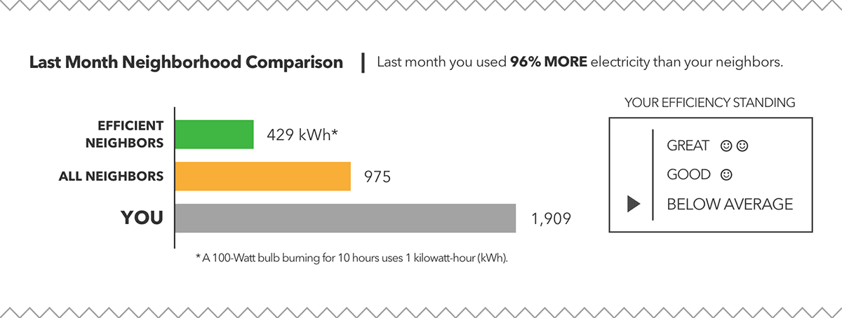
Visualizing Power Consumption
In 2008, in an effort to reduce electricity consumption, the Sacramento Municipal Utility District tried a new technique. They sent 35,000 customers a letter with a few simple charts, showing customers their electricity consumption compared to their neighbors.
In the charts above you can see a bar graph with 3 bars, representing power consumption for 3 different groups: “efficient” neighbors, all neighbors and the recipient’s household. This showed customers if they were consuming more or less electricity than their neighbors.
Customers who received these letters reduced their power consumption by 2% on average (src). While this seems small in terms of an individual’s power bill, across all the customers this amounts to terawatts of electricity and millions of dollars saved collectively. Since then, other utilities around the country have adopted this approach.
Superpower:
Dataviz is a powerful tool for feedback. But what makes these charts impactful isn’t just the feedback (“you consumed X of electricity”), it’s the context the feedback is presented in (“you consumed X, most of your neighbors consumed Y”). As people, we look to others’ behaviors as norms for our own. So by seeing others’ power consumption, people change their own consumption habits to be more consistent with the social norm.
In a related experiment, Schultz & friends found that the same message with an additional smiley or frowny face amplified the effect even further by reinforcing the behaviors of households that were already doing a good job (src).
Takeaway:
Nothing about the electricity usage charts is profoundly insightful, at least not in the way we might think of John Snow’s cholera maps. But even simple visualizations, when paired with an understanding of human and social psychology, can be impactful to large numbers of people. These types of visualizations won’t win a Pulitzer, but in aggregate they can make a big difference in our lives and our communities.
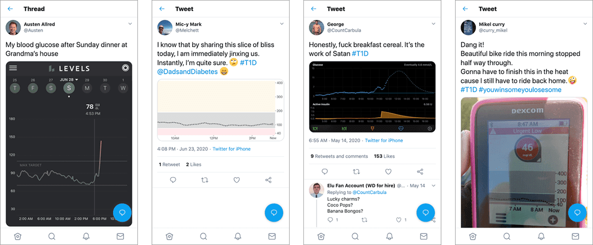
Visualizing Blood Glucose
For the 1.6M people in the US with Type1 Diabetes, graphs like these are never far from top-of-mind. As Continuous Glucose Monitoring (CGM) becomes widespread, these charts have become part of daily life.
Often, the plot of your blood glucose is the story of your day.
If you search Twitter for #T1D you’ll find example after example like the tweets above. What makes these so compelling is that they’re lived data. They’re a reflection of the user’s life. The value is not just the information, it’s visualization as a satisfying memento.
Of course, these charts are also effective. In multiple studies, giving subjects with Type1 Diabetes a CGM helped improve blood sugar control significantly (src, src). For people with Type1, the CGM and these simple plots, are life changing (and occasionally life saving).
Superpower:
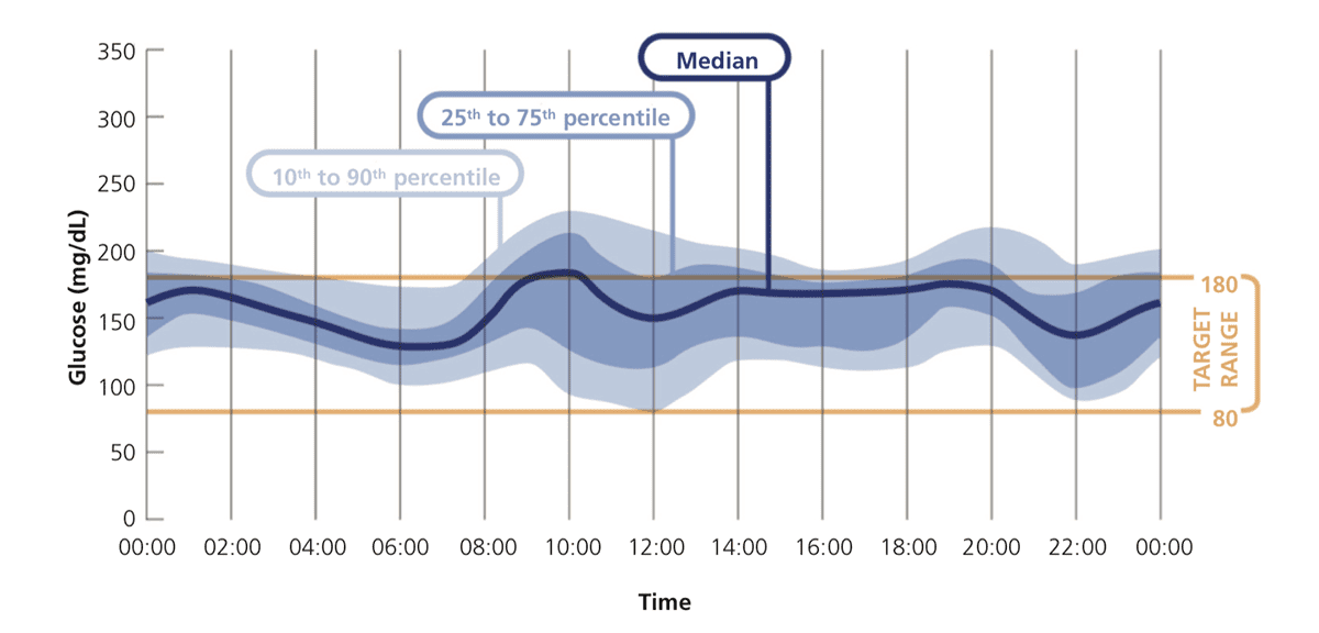
Like Tufte and Powsner’s ”Graphical Summary of Patient Status” (src), which show data in the context of a historic normal range, the chart above from Matthaei & friends presents a target range for blood glucose (because levels shouldn’t be too high or too low). This helps users quickly identify dangerous deviations, so they can take appropriate action (e.g. administering insulin).
While presenting goals as a range is necessary for glucose monitoring, there’s also evidence that representing any goal as a range is more effective than a point value. Targeting a range of acceptable outcomes is simultaneously more forgiving and ambitious, encouraging users to persevere over the long-term (src, src).
Takeaway:
User data is lived data. This enables visualizations that are functional, but can also involve unique dimensions of nostalgia, intimacy and affirmation. Even without revealing new insights (e.g. users already know what grandma’s cooking is likely to do to their levels), there’s still value in visualization as memento.

Visualizing Screen-Time
Older millennials may remember the Gigapet invasion of 1997. Suddenly, everyone in 6th grade had a colorful plastic ornament hanging off a belt loop or tucked in a baggy pocket. Several researchers have shown that the attachment we felt toward these digital creatures is transferable to other parts of our lives that actually deserve our vigilance.
One challenge many of us face is limiting screen time. In 2019, Kenny Chow showed that representing screen time as an infliction on a “lively” animated avatar was a promising intervention toward reducing participants’ screen time (src). The more time users spent with devices open, the sicklier the avatar becomes.
This model of creature-as-data has worked in other contexts. Lin & friends showed that representing physical activity as a virtual fish tank helped participants become more physically active (src). Consolvo and friends showed a similar effect for visualizations of flowers and butterflies standing in for exercise events and goals (src).
At first glance, these representations seem more like “data art” than “data visualization.” But I think the effect is the same. Instead of encoding data for preattentive processing via our brains’ spatial wiring, the avatars encode the data for the parts of our brains that make us social and supportive. We feel the data through our empathy for the “living” character on the screen.
Superpowers:
This probably doesn’t make sense for a Tableau dashboard at work. For many use-cases (e.g. journalism, BI, reporting, etc), immediacy, precision and depth are supreme. For personal-viz, though, some of these constraints can be relaxed:
- If you can assume the user will interact with the visualization multiple times, a longer learning curve is sometimes acceptable (and to the extent that learning the viz can instill feelings of mastery, a steeper learning curve might be desirable).
- Precision is sometimes undesirable (e.g. for weight loss, users can overly fixate on natural ups-and-downs). Representing data on a vague scale like “sick avatar” to “healthy avatar” can help users gain sensitivity to the metric without fixation.
- If the underlying data is relatively simple and a shallower representation creates a sense of emotional attachment, forgoing depth for extended engagement is an easy tradeoff to make.
Takeaway:
The goals and constraints for motivational viz can be quite different from traditional dataviz, making very non-traditional visualizations like Avatars, Fish and Flowers potentially very effective. When the goal is not just conveying information, but creating an emotional connection, tapping into users’ empathy through tactics like anthropomorphization can help form an emotional bond to the underlying data.
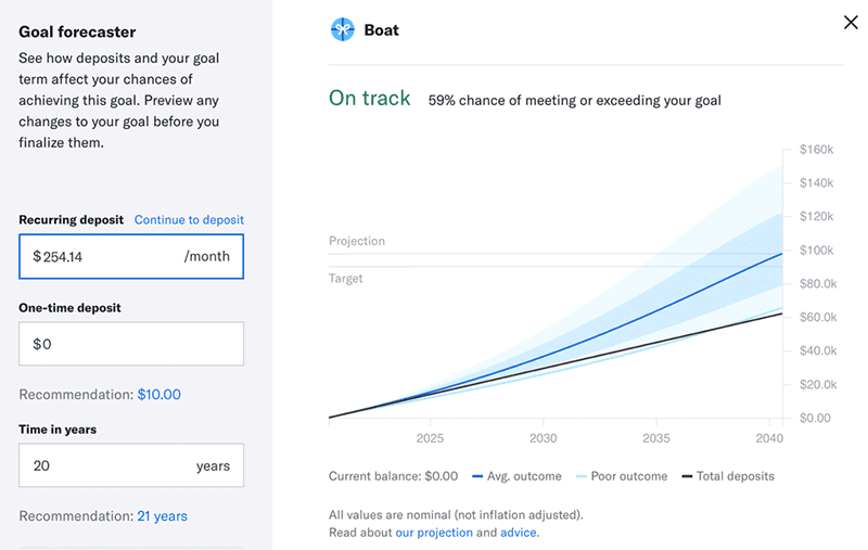
Visualizing Financial Goals
Most brokerage services encourage bad investing habits. From the moment users login, they see charts & graphs of their portfolio performance in the past or the market’s performance right now.
When I spoke with Dan Egan (Head of Behavioral Finance at Betterment), he said this backward-looking focus leads users to reactionary decision making, ultimately hurting their long-term financial outcomes (e.g. “Oh! The market just went down, I have to sell out because I don’t want it to go down more”).
Egan’s research suggests that the more users fixate on portfolio performance, the more likely they are to fidget, and fidgeting lowers users’ expected returns (src).
According to Dan: “In investing, people spend a lot of time looking at history. But you just can’t change history. You can’t change that outcome.” Instead, “the only thing that matters is what you decide to do with today and how that sets you up for the future.”
So Betterment encourages users to look forward by offering visualizations like the Goal Forecaster, designed to “focus you on the future and where you want to end up.” It helps you see “how your actions today put you in a better position in the future.”
Research backs this up. Simulating various saving schedules helps users connect the cause and effect of their actions now (auto-deposit) with likely future outcomes (boat). Making these relationships concrete helps people grasp the effects of complex concepts like exponential growth and motivates users to save more (src, src). Another 2015 study suggests that highlighting the difference between savings goals and savings projections helps participants make better decisions, using the endowment effect to their advantage (src).
Finally, the “Goal Forecaster” helps set realistic expectations. Visualizing realistic expectations about future goals makes us more likely to achieve them (src). Presenting the projected savings in a fan-chart helps reinforce the message that there’s uncertainty in any financial journey, while still conveying the benefits of investing over the long term.
Superpower:
Dan says, consider “showing not telling:”
“If you let people simulate their outcomes - if you let them experience parallel universes - that is more effective in getting them to understand what’s going to happen than if you describe it. Allowing people to really experience it and see the variations allows them to internalize it as real.”
Takeaway:
For Betterment, letting users look ahead is motivational and informational. Simulating short term actions playing out over the long term helps educate users about difficult-to-imagine cause and effect relationships, giving them confidence to make smarter choices. Having realistic expectations about the future helps users prepare themselves for a long journey.
Visualizing Fitness Activity
Tracking physical activity helps many people stay active (src). The challenge is maintaining users’ attention and getting them to stick with the intervention. In this context, visualization can be a tool for both conveying data, and rewarding users for collecting the data in the first place.
Jawbone UP
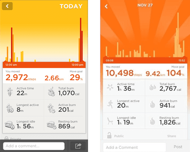
Jawbone’s UP app (circa ~2012) was one of my favorite examples of this. In the screenshots above, there are two bar charts of users’ step counts. For most of the day, you’re seeing a chart like the left, but by the end of the day, once you’ve crossed your goal threshold (e.g. 10,000 steps), the background explodes into a happy sunburst, helping you celebrate the accomplishment!
With wanton disregard for data-ink ratios, Jawbone’s designers were masters at conjuring up visual joy. The effect was users who felt supported and encouraged to keep hitting their goals (and, implicitly, to continue tracking and interacting with the data).
Notch.me
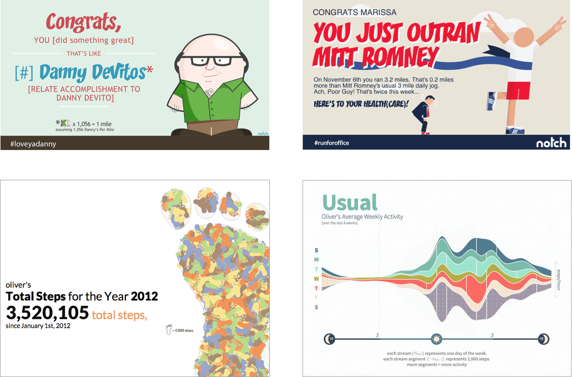
With Notch.me, we did similar work using emailed “postcard visualizations” to heighten user’s sense of accomplishment at various milestones (and create a sense of anticipation for future milestones). The data was sourced from user’s personal activity tracking (e.g. via Fitbit) and presented back to users in various encouraging visualizations like the ones above.
The two top postcards above, use visual metaphor to compare a user’s activity to something unexpected and silly; they’re extremely low data-density, but still quite effective in directing recipients’ attention toward their data.
The two bottom postcards show users’ activity for a set time period (left: 1 year, right: 1 week); this encouraged users to track more consistently during those periods in anticipation of a more elaborate, pleasant visualization (the more you track, the cooler it looks).
In various experiments, visualizations like the above captured user attention and boosted engagement with the data. And, as you might expect from “sugary,” chart-junky visualizations, users loved them.
Superpowers:
Remember Nigel Holmes and the power of humor (src): “My feeling then, and now, is that humor is a good way to get people’s attention. Get a reader to smile, or recognize a visual reference and they’ll surely read on.”
In addition to capturing attention, Holmes’ style of visualization has also been shown to increase memorability of the content (src). Perhaps an overlooked aspect of Holmesian visualizations is that they feel good. This is powerful in its own way: Positive feedback and positive affect (emotion) help people make positive changes.
Takeaway:
For information to make a difference, it has to be seen. Humor, visual metaphor and even pleasant visual flourishes not only serve to draw users’ attention, they’re also emotional and viscerally rewarding methods to reinforce engaging with the data. For Jawbone’s visual flourishes and, pretty much everything with Notch.me, the goal for each visualization was as much about information as it was affirmation.

Visualizing Reading Activities
Kindle’s “Reading Insights” is a relatively new addition to the Kindle iOS / Android apps. I think there’s a lot to praise with this. Reading is another of life’s many activities that, despite wanting to do more of it, we struggle to make it happen as often as we’d like. So offering users a way to track and reflect on their reading could see a meaningful increase in time spent reading.
I think it’s also emotionally satisfying. In the same way a physical book shelf is like a trophy case for nerds, seeing the books you’ve read front and center feels good. Like stickers, it’s a visual representation of your accomplishments that you can feel proud of.
The downside, and this is true of many similar visualizations, is it gives Amazon a justification for even further surveillance (src). This serves as an important reminder that, with this new frontier of data there are ways that it can be legitimately useful to end-users, but that’s not without tradeoffs. As makers and designers we should keep the ethics of personal data use top of mind. (As a silver lining, thanks to CCPA, you can now request all of Amazon’s data on your reading habits to visualize for yourself!)
Takeaway:
Visualizing user data creates exciting opportunities for both users and designers, but it also brings new responsibilities. For every thoughtful blood-glucose visualization attempting to empower users, there’s an Uber out there using behavioral data to manipulate. As we rightly question the role of data and algorithms in a just world, we shouldn’t forget that visualizations, like any non-neutral technology, can be used for harm and for good.
Takeaways:
- Epic, John Snow-eque, Pulitzer-worthy dataviz is amazing, but visualization can also be impactful in everyday use. This seems worth celebrating.
- Instead of revealing the secrets of the universe, user visualization is about offering lenses on a subject that people are already intimately familiar with: Themselves.
- While the medium is the same, design goals for “User Visualization” differ from traditional data-viz. Instead of singular dedication to information gain and/or impacting big decisions, user visualizations tend to benefit everyday activities, impacting more frequent, micro-decisions.
- User visualizations can help in a variety of ways: Encouraging adoption of social initiatives, managing health conditions, helping people persevere toward long-term goals or developing new habits, etc.
- If you’re a dashboard designer, a (data) product designer or anyone else helping users visualize their own data, you’ve got superpowers to inform and inspire.