Through a partisan lens: How politics overrides information.

As information designers, we don’t typically think of our work as political. Our first loyalty is the data. Our job is wresting big, complex ideas out of the platonic ether and squeezing them into two or three dimensions, on a screen or maybe a poster, so that people can better understand the world around them. Normally we worry about challenges like information architecture, dimensionality reduction, or weaving seemingly disparate facts into a cohesive narrative.
But for the most important issues of our day, politics are a crucial lens into how people see the world, and this can impact how they see data.
For example, consider an influential study from researchers at Yale, looking at how political alignment can create blind spots even for analytically savvy participants. Participants were shown one of two different data stories: one on the efficacy of a skin cream for curing a rash, the other on the efficacy of gun control policies for stemming gun violence. The trick: Both stories were based on the exact same underlying data. So if participants read the data to say the skin cream was effective, they should rationally also conclude that the gun control policies were effective. But that’s not what they did.
Even for this highly numerate crowd, responses became polarized along participants’ political party lines. Instead of objectively following the data, when participants saw the politically charged topic, they couldn’t help but interpret the data as evidence to support their prior political positions.
To design effectively, it’s important to understand not just how to construct a clear chart, but how people will actually interpret them. Since politics can be so distorting, it’s worth understanding how it shapes our interpretations. To do this, we’ll unpack the social and political psychology that drive our attitudes and beliefs about big political issues.
Why should information designers care about political partisanship?
Effective dataviz means designing for more than just the data on the page. The context that viewers bring to a visualization can shape how they respond to it. In our politically charged culture, the topics that need the most explaining are often the most political.
Whether we like it or not, the information that we present will be consumed through a partisan lens. By understanding these processes, we can at least address them consciously. This can help in a few ways:
- Adapt to a “fact-free” universe. Information design is premised on information being helpful. But in the bizarro world of politics, attitudes and beliefs aren’t always strictly tethered to any ground truth. Understanding cases like these, when information isn’t useful, can help us choose our battles and prioritize our time for the biggest impact.
- Persuade people with people. When reasons fail, people look to others for guidance. For political issues, we’re heavily influenced by the people around us. Understanding how attitudes can spread through dataviz can help us produce more persuasive visualizations.
- Minimize the harmful side effects of well-intended dataviz. Information can do more than just inform. For example, partisan issue polling charts can increase political polarization. Understanding these unexpected risks can help us mitigate them.
In a partisan environment, if our ideas and decisions aren’t strictly based on information, where do they come from? To understand this we’ll dive into social and political psychology.
Political information psychology
Understanding social and political psychology can help clarify the boundaries of information’s influence. As we’ve already suggested, the facts aren’t always as persuasive as they should be.
On the other hand, some information can be influential in ways that it shouldn’t be.
Social Influences

Social Conformity: If you look up, I look up.
It’s almost a cliche to say that humans are social creatures, but that doesn’t make it untrue. We are comically influenceable by the people around us.
For example, in a famous social psychology experiment from the 1960s, Stanley Milgram sent his research team out onto the city streets of New York City. He instructed them to find a crowded part of town, stop in the middle of the sidewalk, and just look straight up at the sky.
When his team stopped in the middle of the sidewalk and looked straight up, all the busy people walking past not only noticed the researchers’ upward gaze, they also stopped and looked up to see what was up there.
Other silly experiments show similar social conformity effects.
Why are MBAs conservative, and social scientists liberal?
Our social surroundings also influence our theories about how the world works, what we believe in, and what we value.
For example, one study followed 91 students throughout their college careers. 34 of them were business majors and 57 majored in a social science. The researchers wanted to understand how the students’ majors influenced their beliefs, particularly how they explained the causes of poverty and unemployment.
During their first year, students’ majors were uncorrelated with their beliefs, but by the third year, business school students were disproportionately likely to blame poverty on the impoverished while social science students pointed to external, systemic factors.
For these students, the embedded cultural values and beliefs of their course-work and environments influenced their beliefs.
Group Influences

Expressionism’s divisive influence on our youths
The silliness continues when considering the special privilege we give to people who are like us.
The classic experiment highlighting tribalism showed how a group of adolescent boys, with long histories as classmates, were transformed into opposing factions when researchers assigned them to different groups based on their self-reported affinities for Paul Klee or Wassily Kandinsky paintings. Despite the boys’ shared history, when researchers asked them to divide up their participation rewards amongst their classmates, suddenly their prior friendships meant very little.
Instead the boys shifted their allocations dramatically toward their new-found brothers-in-art. This is not to suggest that the nuances of Kleesian vs Kandinskian expressionism were a hot topic for these high schoolers (behind the scenes the researchers assigned their groups arbitrarily).
Instead, this demonstrates how even the most arbitrarily constructed social groups can produce in-group favoritism or outgroup discrimination. In fact other experiments showed similar results when the groups were based on nothing more than a coin toss.
We like people who are like us, even if all we have in common is mutual disdain for some other group of people.
Common ground beyond politics
These social group effects are presumably stronger for political groups, where party members actually have real things in common. Political psychology research suggests that we share some very primal psychological traits and needs with our fellow partisans.
Political psychologists suggest that Conservatives place great value on feelings of security and certainty (while liberals are comfortable with uncertainty, ambiguity and risk). Conservatives also value uniformity in their social groups, while liberals value differentiating themselves. Perhaps because of these low-level psychological needs, members of today’s political parties have a lot in common with their fellow partisans (e.g. particularly for U.S. Republicans, where this also applies to their white, Christina, rural demographics).
This is the basis for the “identity stacking” theory of polarization. This theory observes that more and more of our identity traits have lined up with our political identity. For example, if you know that someone is a Democrat, that also likely means you’ve got good odds on guessing not just their views on climate change, but also which parts of the country they live in, how long they spent in school, how confident they feel about the economy, or whether or not they’re armed.
If we’re influenceable by people who are like us, and we have more and more in common with other people in our political party, then we’d expect our fellow partisans to be particularly influential.
Political Attitude Formation
One thing we all have in common: We’re busy. And we’re tired. (So so tired.) Even if we have the interest, very few people have the time or energy to dive into the guts of tax policies, environmental regulations, or the extended implications of Citizens United. These aren’t necessarily personal failings though. Even for policy makers or people who study public policy, there literally isn’t enough time in the world for a single person to personally, critically research all the issues they might care about. Even if they did, there are rarely clear answers. Policy choices are intrinsically big, complex and multi-faceted.
So, for very practical reasons, people form their attitudes and judgements by listening to other people that they trust.
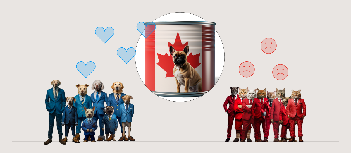
In particular, we look to our political parties to tell us which policies we should support and which ones we should oppose. For example, in “partisan cue” studies, researchers will choose some obscure policy that most people won’t have a strong opinion about (e.g. estate taxes, prescription drug imports, etc), then they’ll say something like “Democrats tend to support and Republicans tend to oppose importing prescription drugs from Canada.” Suddenly an otherwise bipartisan policy has a 10 point support gap between liberal and conservative respondents.
Do we choose our parties based on their policies? Or do we choose our policies based on our parties?
One interesting study stretches these partisan cue effects even further. The researchers told participants about one of two possible welfare programs, either a severely “stringent” program that’s far less generous than the ones we have today (e.g. $250 per month) or a “generous” program that’s far more generous than any available today ($800 per month + extra for health insurance, rent, childcare, job training and 2 years of college tuition).
From an ideological perspective, you’d expect conservatives to favor the former and dislike the latter, and liberals the opposite. However, researchers found that the content of the policy itself didn’t matter nearly as much as who endorsed it. For example, conservatives were willing to support either program as long as they were told it was supported by “95% of Republicans and 10% of Democrats.”
Instead of choosing political parties that match our ideas for how to govern, the process actually happens in reverse. We’re flexible on policies as long as they’re supported by our people.
This presumably makes life quite difficult for Trump supporters. Noting the fact that the former President has taken both sides on most issues, researchers tested the effects of Trump’s erratic policy statements on his supporters. For example, some participants saw that Trump favored abortion “penalties” while another cohort saw that he opposed it. The researchers found that, regardless of the issue, self-identified conservatives rallied to Trump’s position and the substance of the policy made very little difference. That is, their attitudes reflected their perceived political norms, not necessarily the underlying ideals of conservatism.
How can attitudes spread through dataviz?
As we’ve seen, our attitudes are influenced by the people around us. This is especially true for political judgements that are difficult to form experientially. It turns out that this same influence can happen through charts. For example, public opinion polling is a popular topic for political data journalism. What influence might we expect from charts like these?
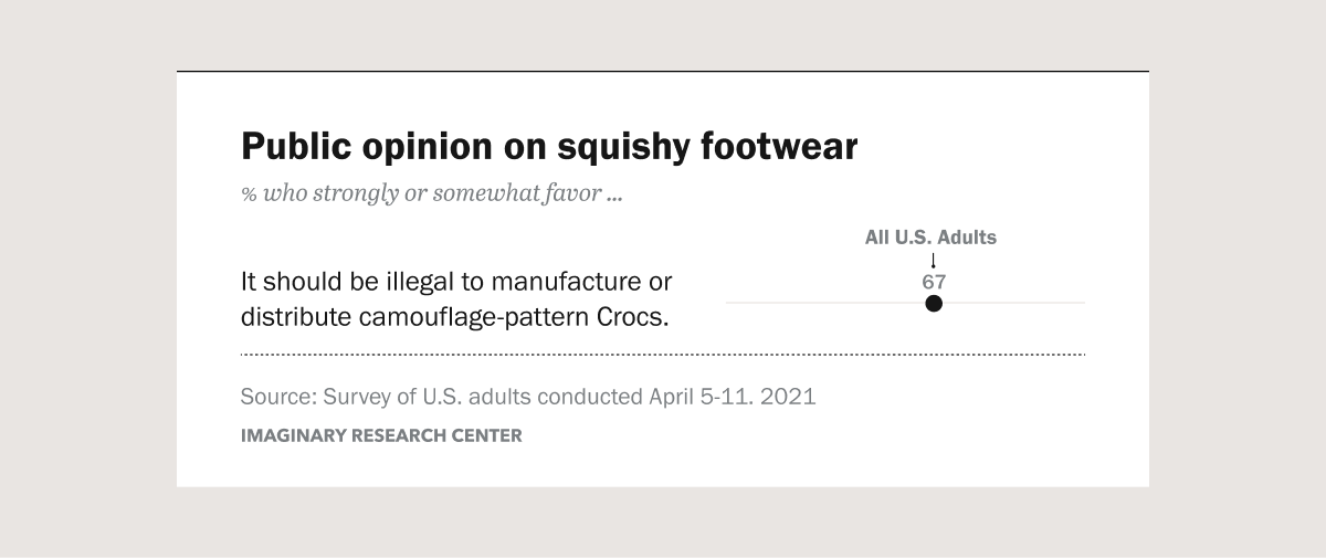
For example, consider the chart above. This chart shows pretend-results from a hypothetical public opinion poll on Americans views of camo-Crocs. Specifically, it highlights the overall popularity for a policy to ban them. Since this shows that the policy is generally popular, we might expect viewers who see this chart to identify with their fellow citizens and adjust their own attitudes to match the social norm shown in the chart. For people who were previously opposed to the policy, social psychology suggests that they’d increase their support. On the other hand, for people who were already very strong supporters, they might actually decrease their support since they see that others are more relatively ambivalent.
This example highlights an important concept: By showing that an idea is popular, charts can make the idea more popular. And vice versa.
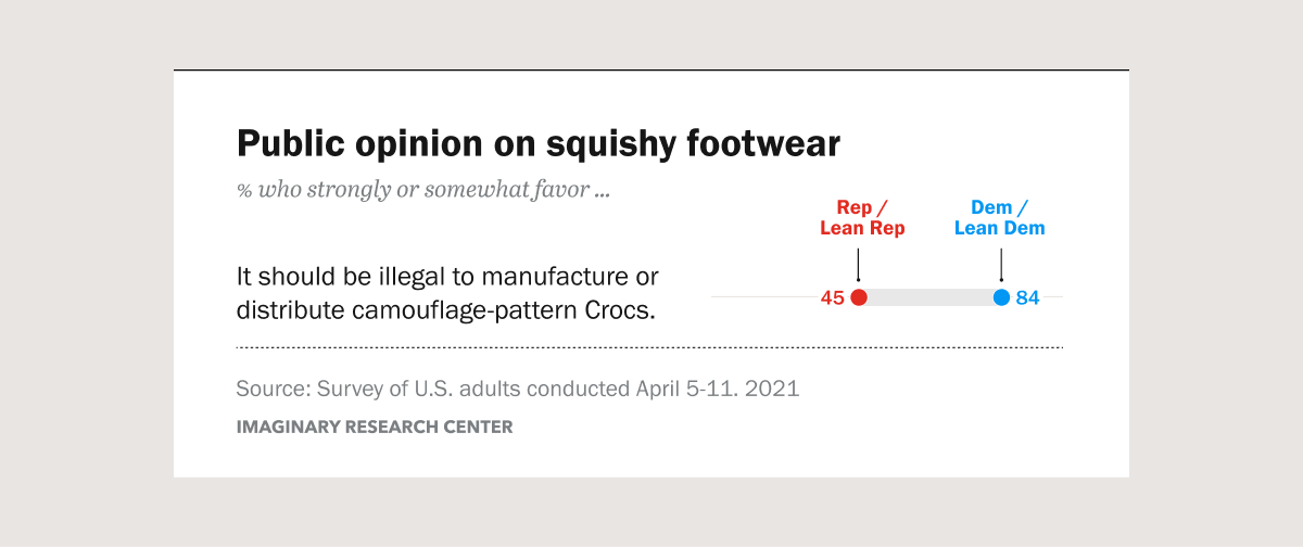
This chart shakes things up a bit. Now it shows the results from our hypothetical opinion poll split by political party. We can see the camo-Croc ban is very popular with Democrats and less popular with Republicans. These are effectively party endorsements, they’re just quantified and visualized. In the last section, we covered several experiments where highlighting a party’s endorsement of a policy changed viewers’ attitudes toward the policy, so we’d expect charts like these to have similar effects. So if a moderate Democrat sees this chart, we’d expect them to increase their support. If a moderate Republican sees the chart, we’d expect them to decrease their support. If a bunch of moderate Democrats and Republicans all see this chart, we’d expect their attitudes to diverge away from each other.
This example shows one of the potential consequences of attitude contagion. For partisan-split polling charts like these, we might expect people’s attitudes to become more polarized. To the extent that polarization is bad, it implies that charts like these have an inherent social cost. They may be valuable (or at least entertaining), but they’re not without risk.
Our recent research suggests that both of these scenarios are very real and that political polling charts can very much influence viewers’ political attitudes. When viewers see a chart showing that a policy is popular, that chart can make the policy more popular. When viewers see a chart showing that attitudes are polarized across party lines, that chart can make viewers more polarized.
So what? What should data designers and journalists do with this?
Alberto Cairo offers a useful maxim for ethical data journalism: “The purpose of journalism is to increase knowledge among the public while minimizing the side effects that making that knowledge available might have.” He summarizes the goal as: “Increasing understanding while minimizing harm.”
As we’ve seen, attitudes can spread from person to person, regardless of their actual content. This means that visualizing attitudes from survey results can have the unexpected side effect of promoting those attitudes. This can be risky in the context of political polarization, as visualizing polarized attitudes can increase polarization.
The social conformity effect can also be harmful in and of itself.
For example, imagine an interest group called “Dirty Handed Doctors of America.” Let’s say they survey their unhygienic-but-medically-credentialed members. Their main finding: “94% of physicians in our esteemed organization strongly agree we should stop washing our hands before treating patients.” The survey finding may, in fact, be totally accurate. Their opinion is wrong, but it could be true that 94% of them support it. Our research suggests that visualizing extreme attitudes like these might help them spread further (like the germs on their filthy, filthy hands). So even though their survey results might be technically true, publicizing them may reduce support for hand-washing among other sympathetic physicians.
This means that we can’t just assume, by default, that visualizing things like polling results are a civic good, simply because they’re accurate and informative. We have a stronger duty-of-care than simply conveying technically accurate information. Since visualizing attitudes comes with an implied risk, we need to consciously weigh those risks versus whatever benefits we expect from publicizing them.
Takeaways
Viewers’ politics can influence how they see the world. This, in turn, influences how they absorb new information. This has a few important implications for anyone visualizing social issues or otherwise politically-charged information.
- Information isn’t as influential as it should be. If all of our attitudes and decisions were purely rational and information-based, the silly effects we highlight above wouldn’t exist. But in the real world, judgments about identical datasets can flip based on a person’s politics. Attitudes toward public policies are more influenced by endorsements than the policies themselves. Information is still influential, but the surrounding social context should be considered as well.
- Information can be influential in ways it shouldn’t be. Since our own political attitudes are so easily influenced by others’, information about attitudes (e.g. polling results) can be quite influential. This influence can happen through simple partisan cues, like whether or not a party supports or opposes a policy. This also means that popular political data-journalism, such as election forecasts or issue polling, can have some toxic side effects like increased political polarization. Information designers should take these risks of attitude contagion into account when deciding what to visualize and how to frame their results.
- The risks of information may outweigh the benefits. Information designers should take the risks of attitude contagion into account when deciding how to frame polling results, or whether to visualize them at all. In most cases we won’t be able to predict the outcomes, or have clear ethical guidelines on their implications, but by raising the question in the first place we can ensure judgment calls like these are at least made consciously and thoughtfully.
Dive Deeper
This writeup is meant as a primer for 3iap’s latest peer-reviewed visualization research, which we presented at this year’s IEEE VIS conference, in collaboration with Georgia Tech’s Cindy Xiong-Bearfield. If you’d like to better understand the pathway from polling charts to polarization please check out our deep dive on the research project.
Dive Deeper: Polarizing Political Polls Design Research Project