Polarizing Political Polls

TLDR
- 3iap’s new peer-reviewed research was accepted to IEEE VIS 2023
- Public opinion dataviz can unreasonably influence viewers’ attitudes
- Visualizing polarized political attitudes can increase political polarization
- Popular polling charts in the media are epistemically sketchy and should be reconsidered to minimize harmful side effects (3iap is happy to help).
Effective dataviz means more than accurate, readable charts. If our goal as data designers is encouraging more reasonable beliefs and decisions, then designing effective dataviz requires understanding the many ways that even good data can lead to bad conclusions.
It also means recognizing that dataviz can actually make this worse. Even clean, honest charts can lead to surprisingly unreasonable beliefs about the stories behind the data.
In the United States, our politics are an overwhelming source of unreasonableness. It’s well-reported that political polarization is bad for governance, bad for relationships, and bad for the social ties that bring a society together.
What’s maybe less understood is how polarization actually makes us unreasonable. As we’ll see, it’s associated with a variety of cognitive impairments like rigid thinking, overconfidence, intolerance, and motivated reasoning. Partisanship can also unreasonably shape our attitudes about weighty topics like public policy.
Political opinion polls are another area where dataviz can backfire and make viewers less reasonable. For example, it turns out that popular ways of visualizing polarization can actually make it worse.
In our new research we explored some surprising impacts of visualing public opinion polling results, a popular use of dataviz in political journalism.
3iap designed and ran three different experiments, testing nine different ways to visualize political attitudes, looking at six different topics of public policy, with a pool of thousands of research participants. We collaborated with Georgia Tech’s Cindy Xiong to analyze the findings and publish the results. Our paper passed multiple review rounds from a panel of academic data visualization experts and was accepted for publication by the highly-selective IEEE VIS conference.
For all this fuss, we’re able to offer two important findings. Our research is the first to demonstrate:
- Public opinion visualizations have a social conformity effect. Charts showing that an idea is popular can make the idea more popular. When viewers saw that certain policies were popular with their groups, the policies became significantly more popular with the viewers themselves.
- Visualizing polarization can make it worse. For specific types of charts, these social influences can take the shape of polarization. When viewers see that attitudes are polarized by party, their own attitudes become more polarized across parties.
In this post we’ll attempt to unpack the findings in a way that’s bearable for designers, analysts, and data journalists who don’t want to suffer through the paper itself (we don’t blame you!). We’ll also add some additional context and color that we couldn’t fit into the paper itself and offer some more concrete takeaways for practioners.
Research Questions
The work is organized below, by question. You can click the links below to navigate within the page.
- Theory: Is this even plausible? How could innocent public opinion charts possibly increase political polarization?
- Hypotheses: What, precisely, are we expecting?
- Establishing an effect: Can realistic public opinion visualizations impact viewers’ attitudes toward a polarized topic like gun control?
- Social Conformity: Are visualized attitudes contagious?
- Polarization: Can chart-induced social conformity impact polarization?
- Broader Impact: What are the stakes? Is this a problem?
- Design Implications: What are the practical implications? What should journalists, analysts, and visualization designers do differently?
Theory
How does political polarization work? How could dataviz possibly impact something so big and nebulous as political polarization?
What is political polarization?
When people talk about polarization, they’re intuitively describing a situation where two different groups who disagree with each other so much that they can’t work together. They disagree on so many things, or with such force, that there’s no common ground where they can meet and build any kind of consensus. More specifically, polarization typically means one of two popular technical definitions:
- Issue polarization is how we feel about ideas. Ideas can be either broad ideologies or specific policy proposals. For example, U.S. attitudes toward issues like abortion and guns are strongly divided across party lines and “compromise” solutions to either issue are essentially non-existent. People also diagree on broader issues like “the size of government” or “personal responsibility.”
- Affective polarization is how we feel about people. How much do we like people in our own party? Or, more telling, how much do we dislike people from the other party? By this definition, we’re more polarized because we increasingly dislike people from the other party.
In the United States, we’re increasingly polarized across both of these dimensions and they’re actually self-reinforcing. It’s intuitive to imagine that disagreeing on policy issues might make us grumpier toward the people we disagree with. Some research suggests it can go in the other direction as well (i.e. affective polarization can drive issue polarization).
For this study, we focused on issue polarization, exploring viewers’ attitudes toward specific policies, because this type of polarization shows up so frequently as charts in the news.
Why is polarization a big deal? Who cares?
Polarization makes it harder for opposing groups to work together. Intuitively you can imagine the tense feeling of sitting down to Thanksgiving dinner between your always-aggro, MAGA-loving uncle and your too-smart-for-her-own-good, DSA-supporting niece. Given a little bit of jet-lag and a few glasses of wine, any remotely interesting topic (e.g. climate change, gun control, health care) is sure to ignite some sparks.
This tension can have far-reaching effects in every part of society.
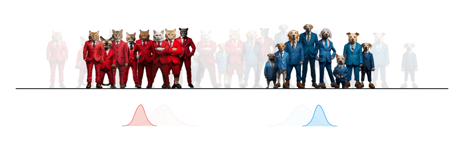
- Social cohesion. The awkward thanksgiving effect plays out in larger society. People divide themselves geographically based on political preferences. They increasingly refuse to date across party lines (and marriages fail at a higher rate when they cross party lines). People stereotype and demonize their fellow citizens, describing them as “closed-minded, dishonest, immoral, and unintelligent.”
- Governance. Imagine that same tension in the halls of Congress, between the 535 elected officials we trust to run our government. Congress is like one big, awkward Thanksgiving dinner where you can only talk politics. Polarization makes it difficult for the government to adapt to change with big policy positions. More recently, we’ve seen it can also make more routine procedures painful (e.g. raising the debt ceiling or funding the government).
- Information resistance. Partisanship can make us resistant to facts. Researchers suggest it gives us a sort of tunnel vision and is associated with a variety of cognitive impairments like rigid thinking, over-confidence, and intolerance. It can raise blind spots to very basic information. Politically motivated analysis can also affect people who are otherwise analytically savvy. It’s worth noting that this isn’t some impenetrable veil. Facts are still influential, they just have more hoops to jump through.
- Life-or-death personal decisions. Covid-19 offered dramatic tales of unreasonable partisan decision-making. For example, researchers found, that the more someone disliked Democrats, the less likely they were to follow public health guidance. There’s a tiny bit more nuance than “Catching Covid to Own The Libs,” but not much: People in hot spots were more likely to adopt “an accuracy motivation” and wear a mask, but even then conservative adherence lagged behind expectations. These individual decisions might explain wider impacts, like the mortality disparities between “red” and “blue” states.
What’s the psychology of polarization?
Polarization is complex. There are lots of interconnected chains of causes and effects. Social psychology offers a revealing lens into the tangle, which we cover here: Political psychology primer for information designers.
What is public opinion polling? Why does it matter for politics?
Public opinion polls are a popular topic of political data journalism and some of the most prominent examples of dataviz in the media. We’ll unpack two versions of this: election vs issue polling.
Election Polling
Election polls survey people about candidates in upcoming elections, loosely attempting to forecast the final results. Presumably this might offer some public good, as candidates could use polling results as a feedback loop to calibrate their platform to the needs of the electorate. In reality this is the data-journalism version of “horse race” political reporting.
Election polls have created a lot of fuss in the last few years. In addition to promoting the “horse race” view of politics (and eroding the pillars of democracy), they also suffer perceived accuracy issues and might even distort voter turnout. For example, in 2016 Hilary Clinton was predicted to win the popular vote, and she did. However, Clinton’s commanding lead in the polls also reportedly led some of her supporters to complacency. They saw her as the inevitable victor and concluded their votes weren’t needed for her to win.
Venerated pollsters like Pew and Gallup have given up on this type of polling entirely, citing opportunity costs. The subtext being that even though these two highly-respected institutions might do a fine job at election forecasting, they don’t think it’s worth the effort (or their reputations). Instead, they’ve shifted their focus to the issues.
Issue Polling
It doesn’t always feel like it, but apparently politicians are occasionally responsive to their constituents. How do policymakers know what their constituents want though?
Citizens are typically invited to contact to their elected officials. This is a somewhat biased signal from politicians’ perspective though, since it tends to favor older or more educated people who have the time and inclination to reach out. There are also, of course, ~12,000 lobbyists that policymakers can turn to, in case they’re curious to hear what’s important to people with money. For everyone else though, there are opinion polls.
According to Pew: “The basic goal of a good public opinion poll is to give everyone in the population, regardless of their wealth, age, education, race, knowledge of politics… an equal voice about the issues of the day.”
At their best, public opinion polls give voice to the voiceless, guiding policymakers with an unbiased window into what’s important to their constituents. Through the miracle of random sampling, public opinion surveys reach a more representative set of constituents than policymakers might otherwise hear from. Presumably, policymakers can then use these survey results to align their policies with their constituents’ priorities.
Polling results also make for popular stories in the news, as part of an overall trend of increased media coverage of polarization. In particular they’re often used to highlight political polarization. That is, instead of simply reporting whether an idea is popular or unpopular nationally, results are split out by political party to highlight the partisan gaps between Democrats and Republicans. While it’s not clear how the “red vs blue” framing advances pollsters’ “equal voice” aspirations, decomposing results by party can help explain the underlying politics of a particular idea.
Despite their popularity, these visualizations can have toxic side effects. By highlighting polarization, they can make it worse.
What’s the pathway from public opinion to polarization?
Our attitudes are heavily influenced by the people around us. This is sometimes referred to as “social conformity” and it can very much effect our political attitudes.
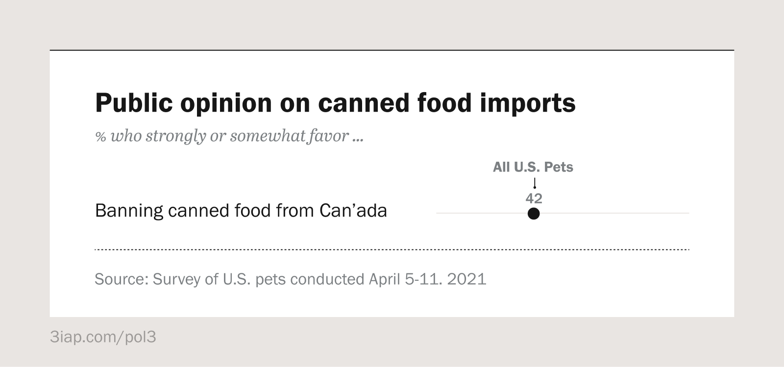
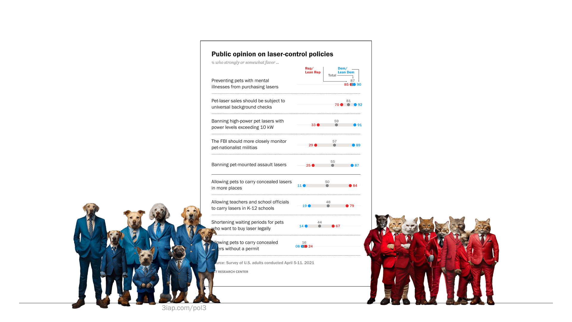
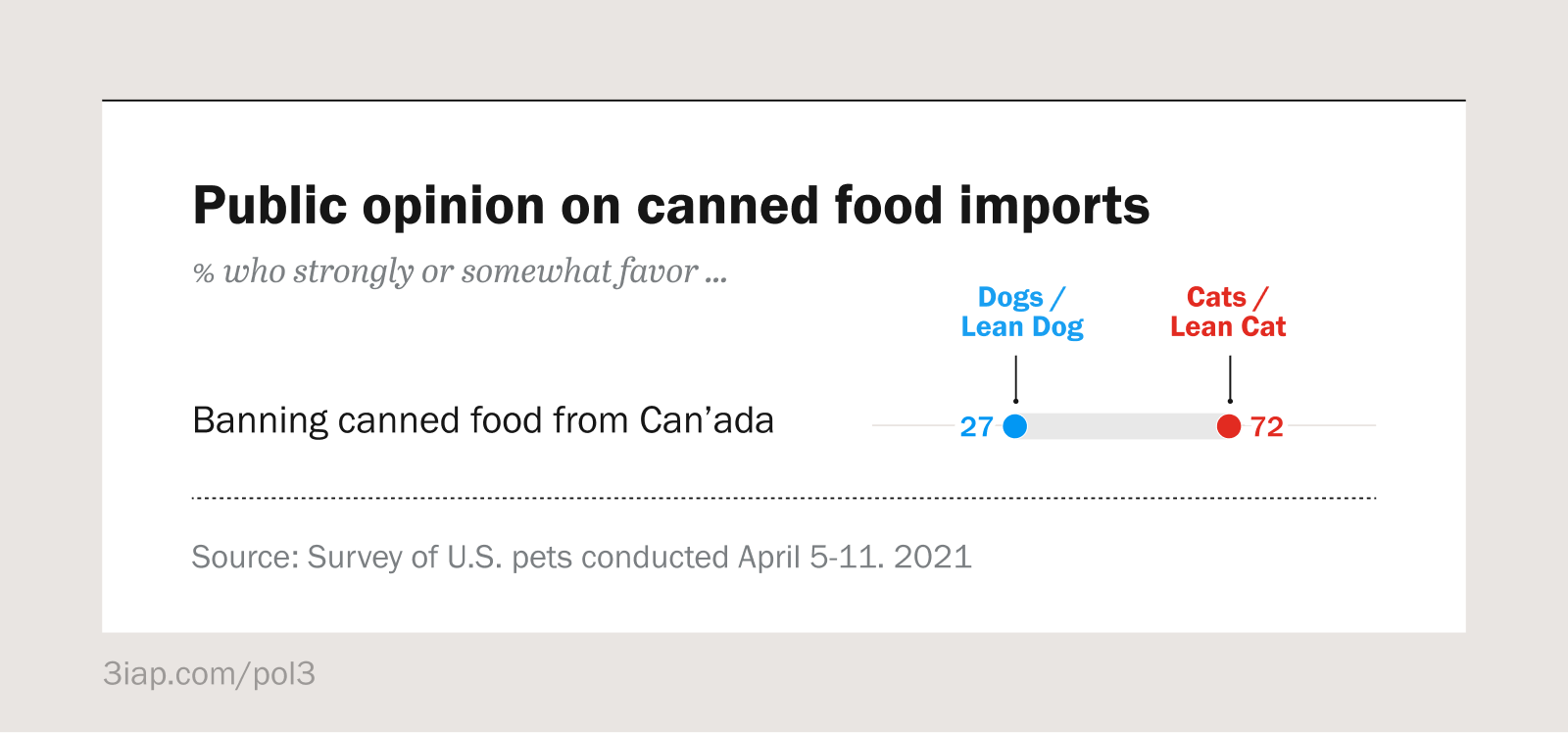
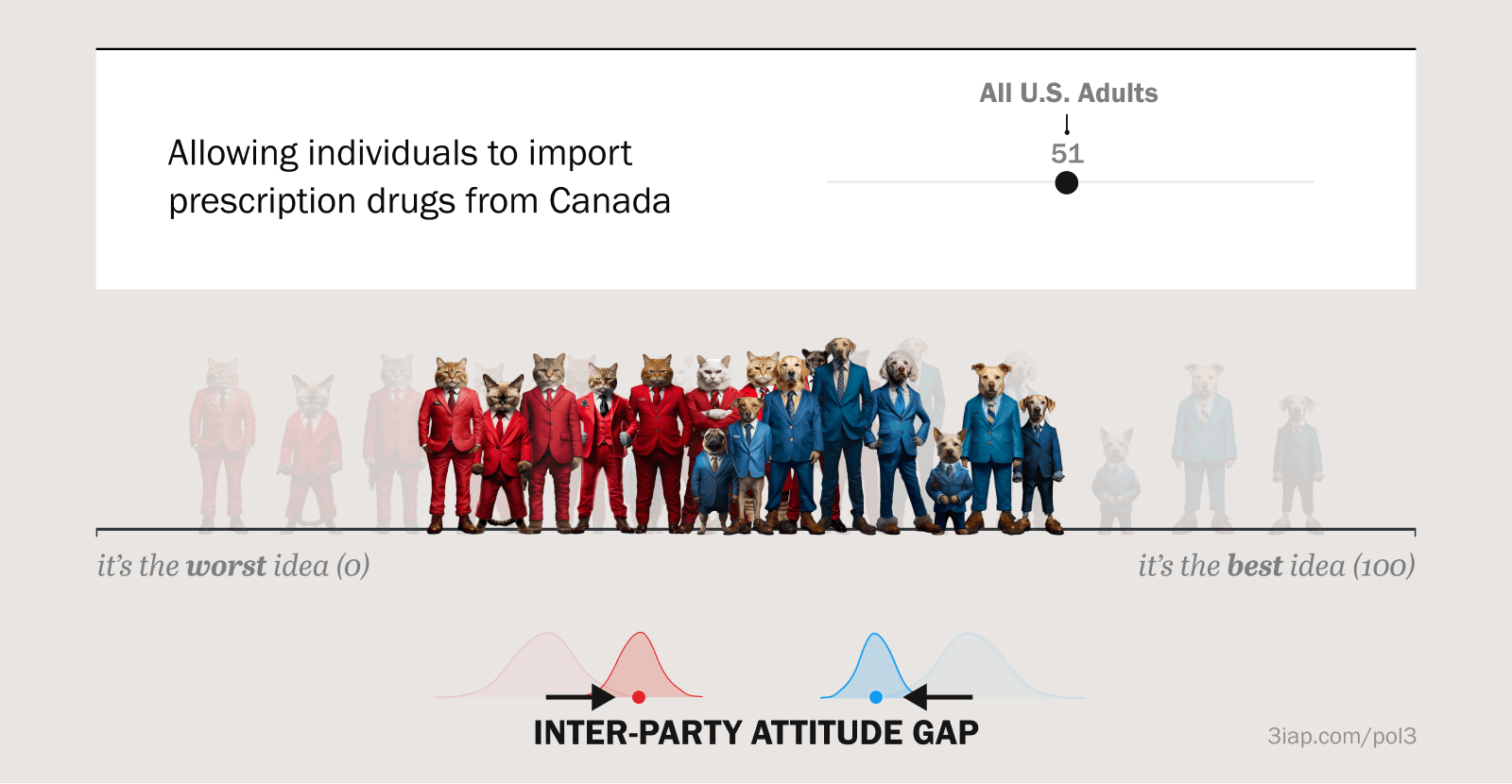
For example, this chart shows pretend-results from a public opinion poll. The poll asked American Dogs and Cats (“All U.S. Pets”) how they feel about a policy proposing that the United States ban imports of canned pet food from Canada.
Specifically, the chart shows that this policy is generally unpopular. It’s supported by only 42% of the population. Based on social psychology, we might expect that if our pets were browsing the internet and saw a chart like this, they’d identify with their fellow pet-citizens and adjust their own attitudes to match the social norm shown in the chart. For viewers who were previously supportive of the policy, theory suggests that they’d decrease their support. On the other hand, for viewers who were already against the policy, they might actually increase their support since they see that others are more relatively ambivalent.
This example highlights our first research question: If a chart shows that an idea is popular, can the chart make the idea more popular?
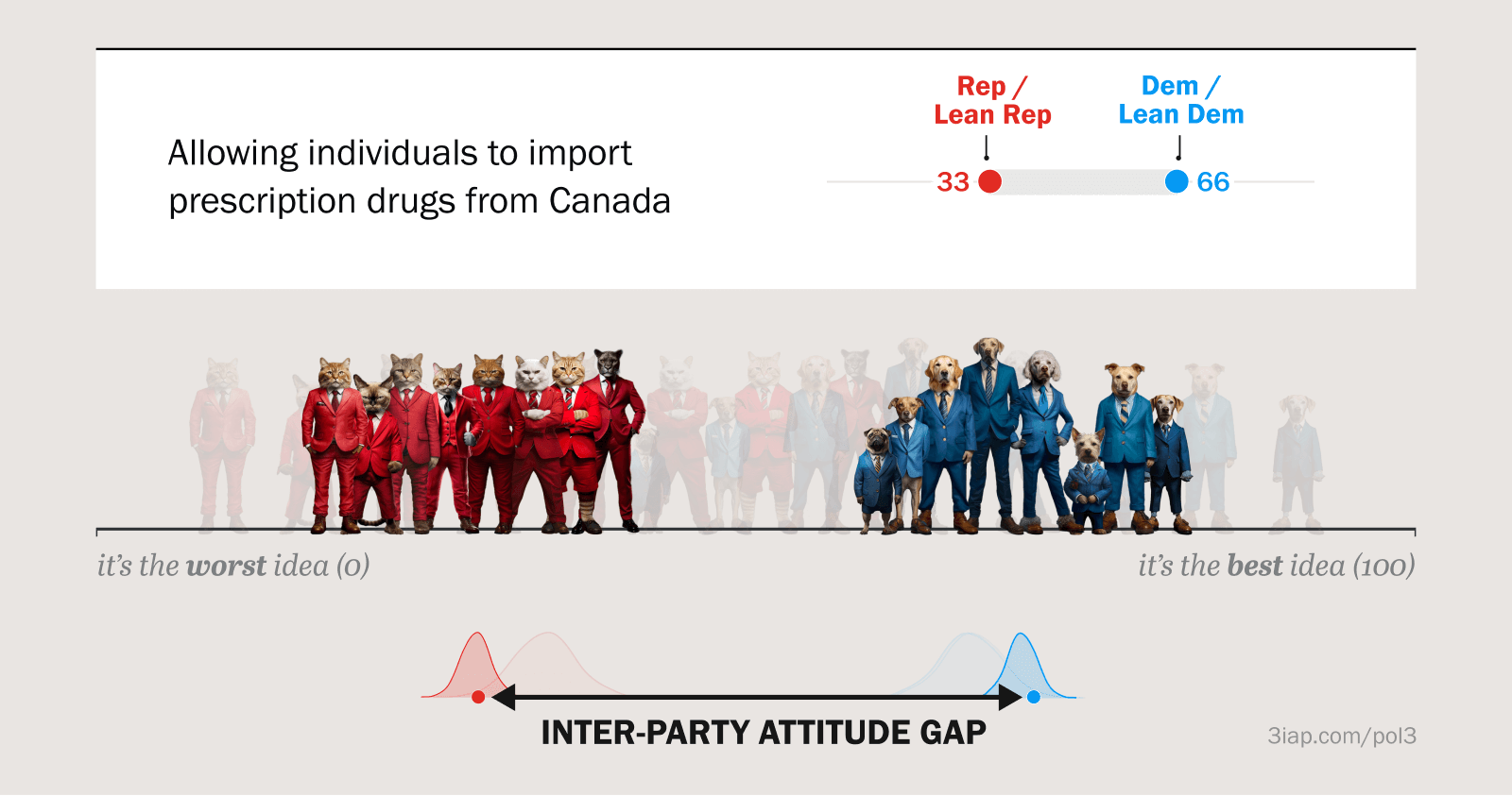
We might expect a similar social conformity effect toward political parties. We’ve reviewed several ‘partisan cue’ studies where highlighting a party’s endorsement of a policy can dramatically change a viewer’s attitudes toward that same policy. Showing polling results split by political party should have a similar effect.
For example, this chart shows the same fictional pet-survey results, now split by political party (supposing, of course, that Dogs and Cats are political adversaries). We can see the ban is popular with Cats (supported by 72%) and unpopular with Dogs (supported by just 27%). These are effectively party endorsements, they’re just quantified and visualized.
Since partisan cues can change viewers’ attitudes toward endorsed policies, we’d expect charts like these to have similar social conformity effects. So if a moderate Dog sees this chart, we’d expect them to decrease their support (toward 27). If a moderate Cat sees the chart, we’d expect them to increase their support (toward 72). If a bunch of moderate Dogs and Cats all see this chart, we’d expect their attitudes to diverge away from each other.
This example highlights a potential downstream effect of attitudes spreading through charts like these. For partisan-split polling charts, we might expect viewers’ attitudes to diverge across party lines and become more polarized.
This raises our next research question: Can visualizing issue polarization increase polarization?
Hypotheses:
What were we expecting from the experiment? The research questions we just outlined led to our basic hypotheses. Here they’re just slightly more formalized, similar to the paper.
- H1: We suspected that public opinion charts do more than just communicate opinions, they can actually shape them.
- H2: We expected public opinion charts to have a social normative influence, or a social conformity effect, where people align their attitudes with the attitudes they see from their social or political groups.
- H3: We suspected that some of these charts might actually influence polarization, either increasing it by shifting group attitudes away from each other, or decreasing it by shifting them closer.
- H4: We expected these polarization influences are related to the way charts are framed. Charts showing the national consensus should cause people’s attitudes to converge toward the middle. Charts showing polarized partisan attitudes should cause people’s attitudes to diverge away from their out-party.
Experiment #1:
Establishing an Effect
Can realistic public opinion visualizations impact viewers’ attitudes toward a polarized topic like gun control?
Motivation
In our first experiment, we wanted to rule out neutrality. Specifically, we wanted to see if realistic charts of a hot topic issue (i.e. gun policy) could actually influence viewers’ attitudes. If all these charts did was passively relay information, we wouldn’t expect them to have any influence on viewers’ attitudes toward gun policies. (And then we’d have to go find a new chart to pick on.)
Setup
We’ll describe the experiment below, but the quickest way to grok is trying it yourself. We have a demo version here: Experiment #1 demo.
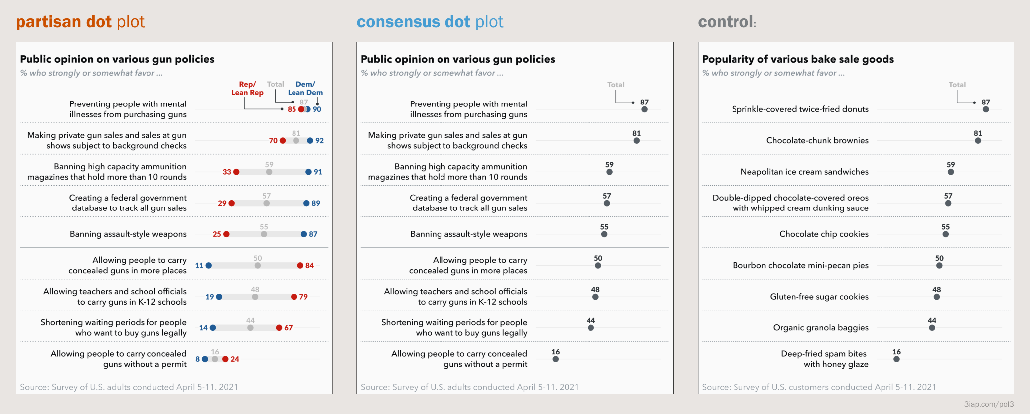
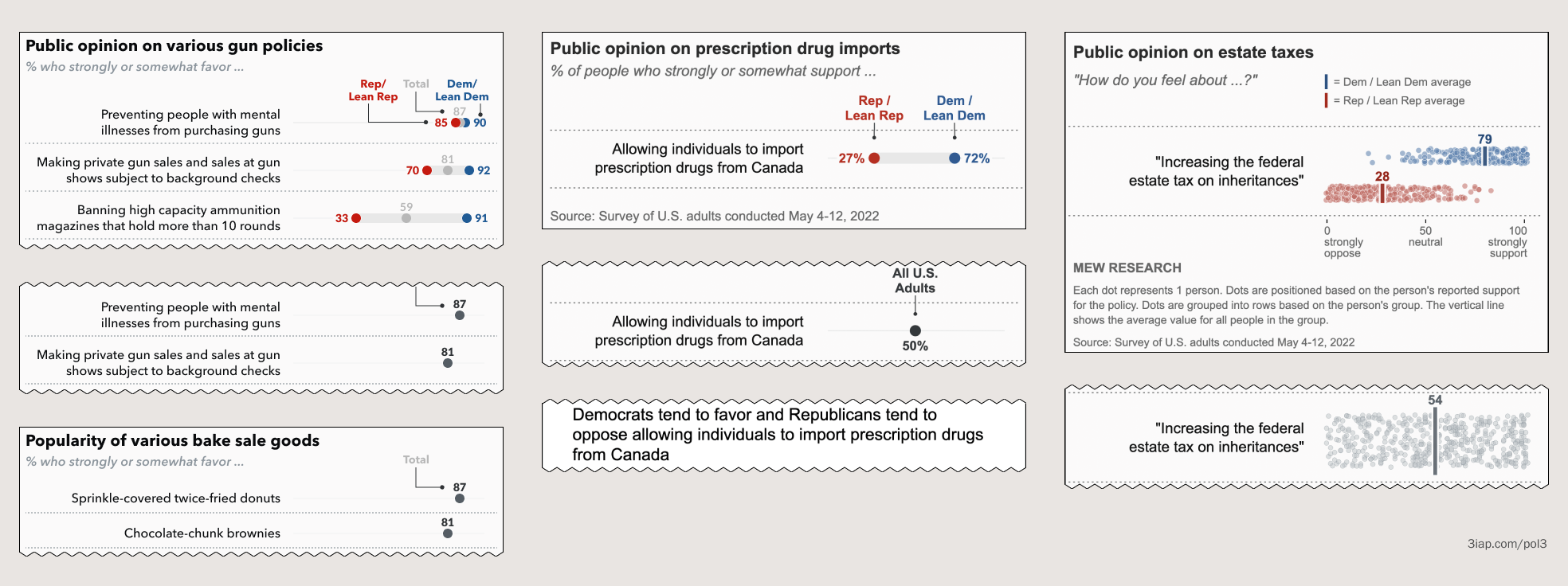
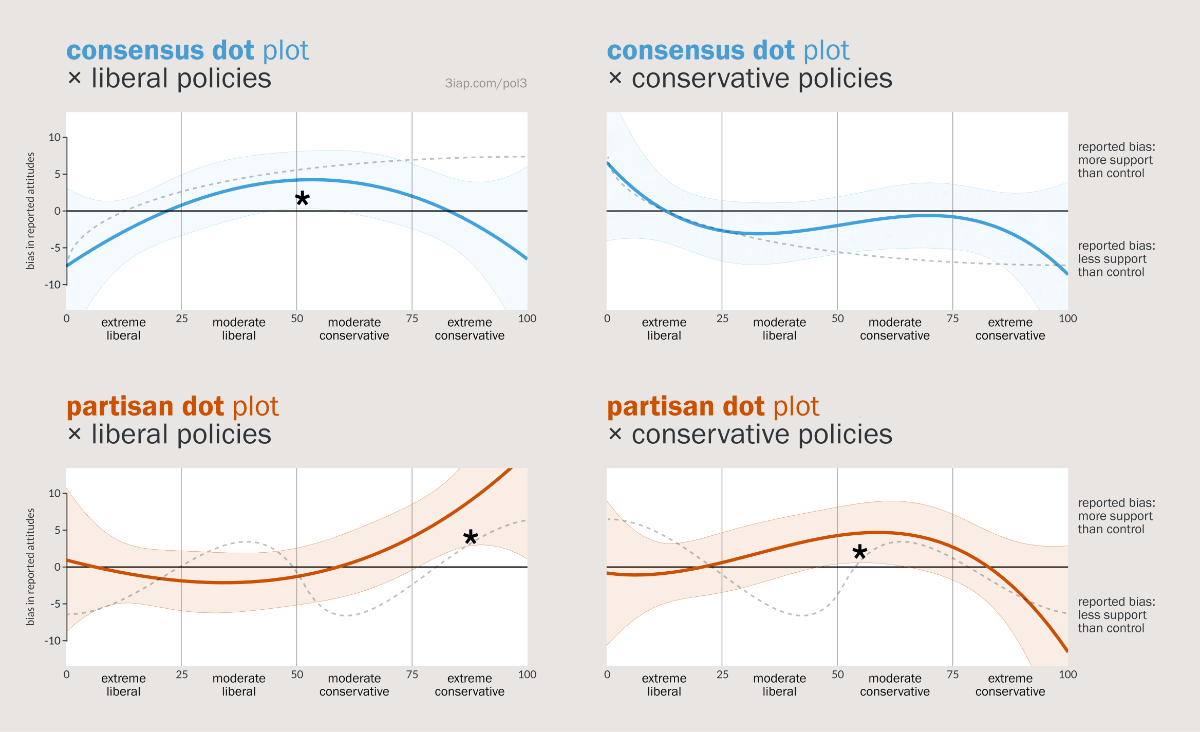
We tested three different charts, designed to look like visualizations you’d see from one of the big-name pollsters. Each chart shows a stack of policy proposals (or baked goods) and how popular they are with various groups.
These charts are fairly dense. They’d require viewers to slow down a bit to take them in. And since they cover nine different policies they would be tough for people to remember any specific value. So we generally expected these to be read as a broad gists like “Democrats support policies like federal gun databases and banning high-capacity magazines. Republicans don’t support these policies. The gap is pretty wide.”
- The partisan dot plot chart on the left includes a dot for the overall national popularity AND a dot for either political party. We’d expect viewers to anchor to some combination of their political party and the national consensus dot.
- The consensus dot plot in the middle is identical to the previous chart, except it drops the partisan dots and just shows the national consensus. We’d expect participants, regardless of their party, to anchor to this common-ground, national identity.
- Finally, the control matches the consensus dot plot, except instead of gun policies it talks about baked goods. As pervasive as politics has become in the United States, we were assuming that donuts and cookies wouldn’t be politically triggering for most people (hopefully), so this shouldn’t impact their attitudes towards guns.
We asked participants to first answer a few comprehension questions about the chart (e.g. “What is the average favorability of ‘Banning assault-style weapons?’”). This was a sneaky way to ensure they engaged with the middle six policies on the chart. After that, on the next page, participants reported their own attitudes toward those same six policies. This setup was maybe a bit overwhelming in hindsight, but it ensured that any effects we saw would have to be at least durable enough to influence participants after a few minutes had passed.
What might influence look like?
Our analysis approach was complicated, but given the number of variables it kind of had to be. Participants’ responses could reasonably depend on several different factors like the policy itself, their perception of the policy’s political lean, the policy’s actual popularity, the popularity we showed to people, and the participant’s personal politics. Each of those factors are independent of which chart we actually showed them. We’ll walk through a couple of examples to make this more concrete, but first let’s talk about the results we might expect.
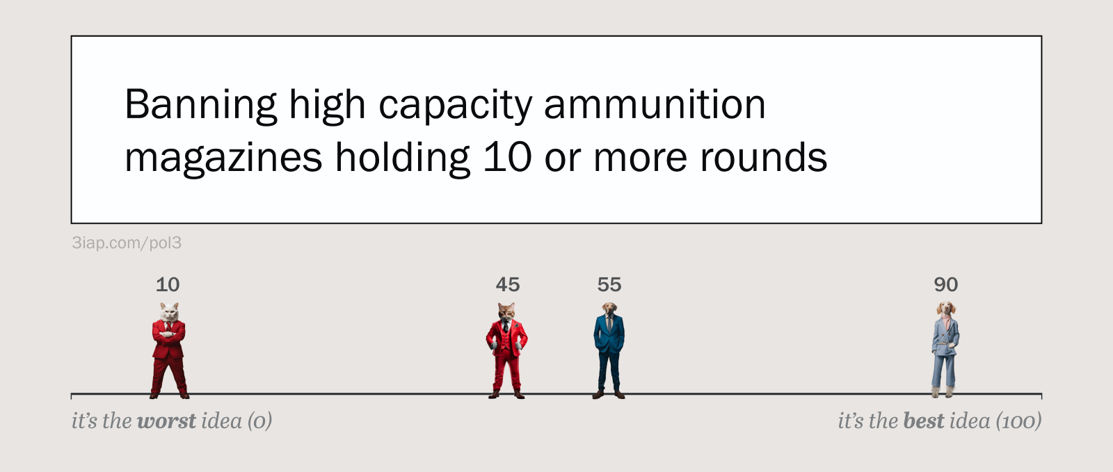
To start, let’s consider four different participants, with different levels of support for a policy like “Banning high capacity ammunition magazines holding 10 or more rounds.” We can see each participant with their hypothetical support level (from 0—100, representing least to most support). This includes the following:
- A extremely conservative Cat strongly opposed the policy (10),
- A moderate Cat moderately opposed (45)
- A moderate Dog moderately supportive (55)
- An extremely liberal Dog, strongly supportive (90)
In this example we’re assuming that political alignment and support for gun control are closely aligned, which they actually are in reality (though not as much as you might expect…).
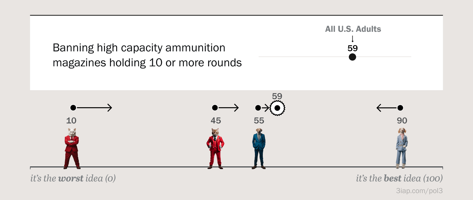
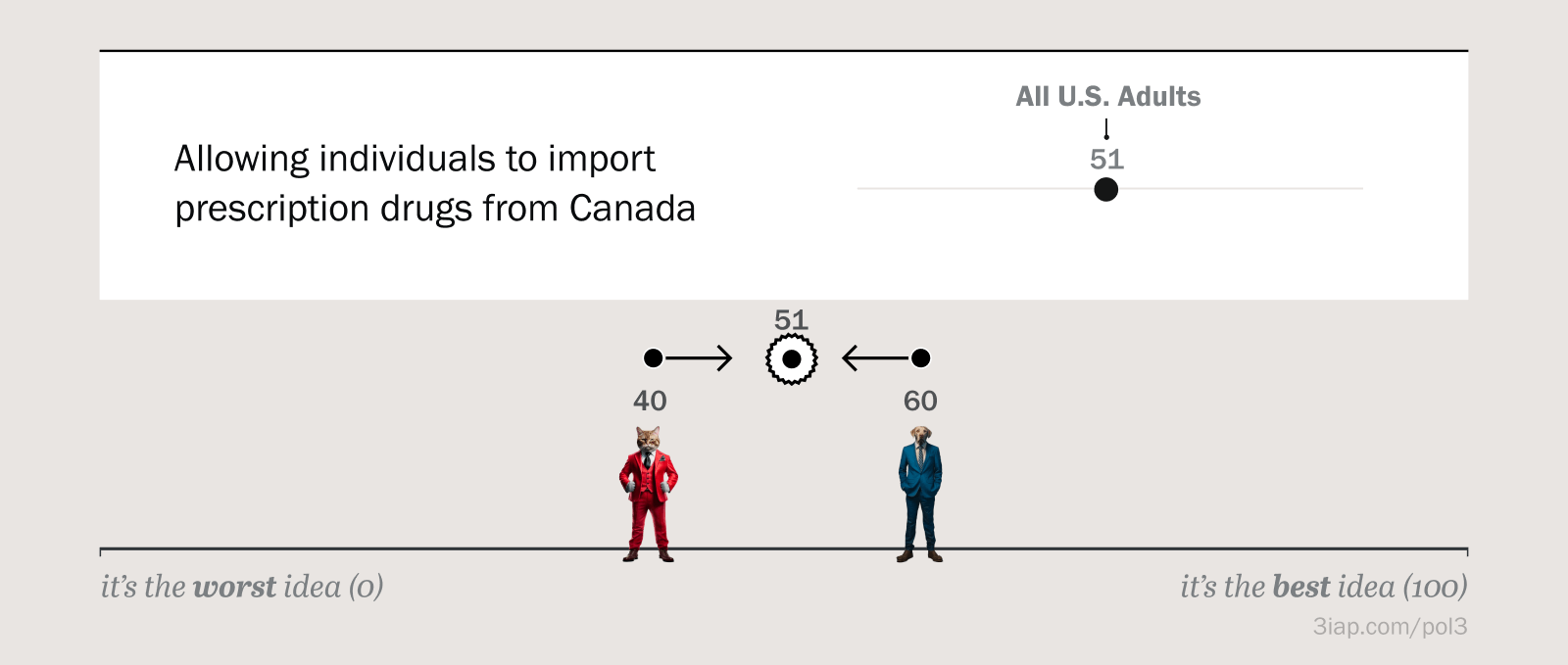
Let’s assume these four participants are influenced by the chart above. The chart shows that the policy is somewhat popular, supported by 59% of U.S. Adults. Three participants are originally less supportive than the norm shown in the chart (10, 45, 55 are less than 59). One participant is more supportive than the norm shown in the chart (59 < 90). If our theory holds up, we’d expect the three participants with less baseline support to increase their support after seeing the chart (right arrows). This is fairly intuitive; seeing that an idea is relatively popular can make it more popular.
We’d also expect the participant with high baseline support (90) to reduce her support (left arrow). This is maybe less intuitive; it implies that a relatively extreme liberal is reducing her support for a popular liberal policy, but in this case conforming with the norm of “All U.S. Adults” means moderating her relatively strong belief.
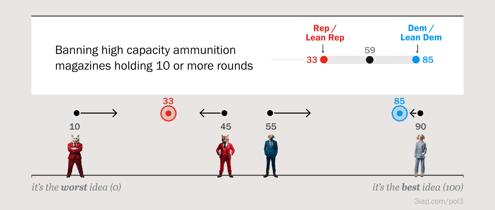
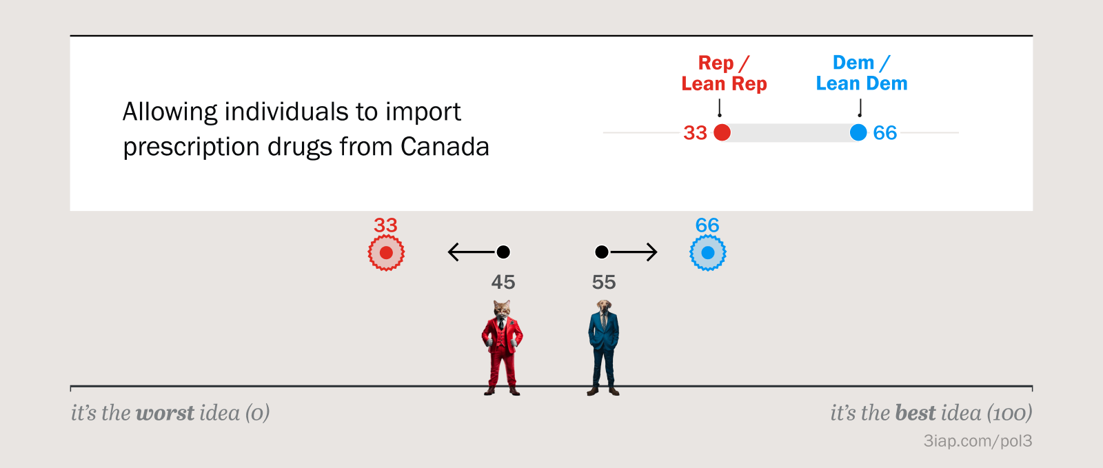
What happens with this “partisan split” chart? Instead of just showing overall national support, this chart also shows that the policy is popular with Democrats (with 85% support) and unpopular with Republicans (with 33% support). If our participants had seen this partisan chart, we’d expect slightly different effects.
Notice that the moderate conservative cat’s (45) attitude is now shifting in the opposite direction, decreasing from his baseline support (left arrow). This is because he sees that policy is unpopular with his political group.
For the other three participants, their directions of attitude change are the same as if they’d viewed the consensus chart (converging toward the middle). The extreme conservative (10) becomes more supportive, the moderate liberal (55) becomes more supportive, and the extreme liberal (90), moving toward the middle, decreases her overall support because his baseline attitudes are so extreme that he’s presumably surprised at how low the policies support is with fellow democrats.
This gets complicated because this single chart could lead to possibly alternating directions of attitude change, depending on participants’ political alignment and the values shown in the chart. Notice that the arrows above alternate directions (right, left, right, left).
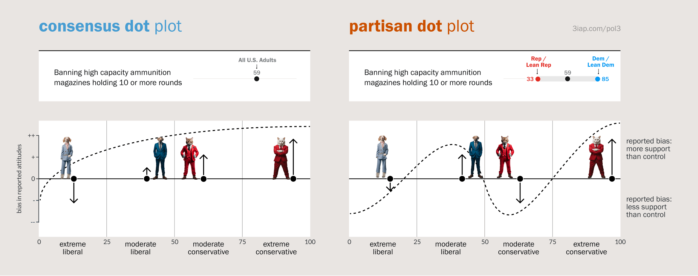
Since we can use participants’ political alignment as a proxy for their baseline attitudes towards gun policies, this is another way we could look at the previous two examples we just walked through. Above the x-axis represents participants’ political alignment, and the y-axis represents the direction of attitude change. The dotted lines show the rates of change we might expect if our theories were true. Notice the directions of the arrows match our previous examples, but they’re flipped and turned 90 degrees.
So what results did we actually see?
Results
The results for Experiment #1 are messy. They suggest some kind of social conformity effect, where participants indeed changed their attitudes in response to their identity groups, but we can’t yet speak to polarization.
The plots above show participants’ response curves (color lines) compared to our theoretically expected results (dashed lines). The stars indicate places where the bias was significantly larger than zero, indicating a subset of participants who were significantly influenced by the charts. This happened in three different places, each of which are roughly where we’d expect, given a social conformity effect. This suggests that participants perhaps updated their attitudes to better align with their social groups. However, the curves don’t line up exactly with expectations, or show clear separation from zero for other political segments.
Even though 2/3 of these results could be interpreted as polarizing or depolarizing influences (if you squint hard enough), we shouldn’t read too much into them except to say “Hey look, these charts affect viewers attitudes, even though they shouldn’t.”
After running this experiment we realized quite a few things about our setup that might have muddied the results. So in Experiment 2 we made some adjustments and were able to get a much clearer signal.
Experiment #2:
Social Conformity
Are visualized attitudes contagious?
Motivation
Our results from Experiment 1 suggested a social conformity effect, but they weren’t particularly clear cut. In Experiment 2 we made a few changes to better suss out the effect. As a reminder, the social conformity effect would be interesting for two reasons:
- On its own, it implies that an important dynamic in social psychology translates into charts. It would mean that charts showing something is popular have the power to make it more popular.
- The effect is also interesting because it’s a prerequisite for how charts like these might influence political attitude polarization.
Setup
Again, we have a demo here that you can walk through: Experiment #2 demo.
You can change the assignmentId value in the URL to generate different variations of the stimuli.
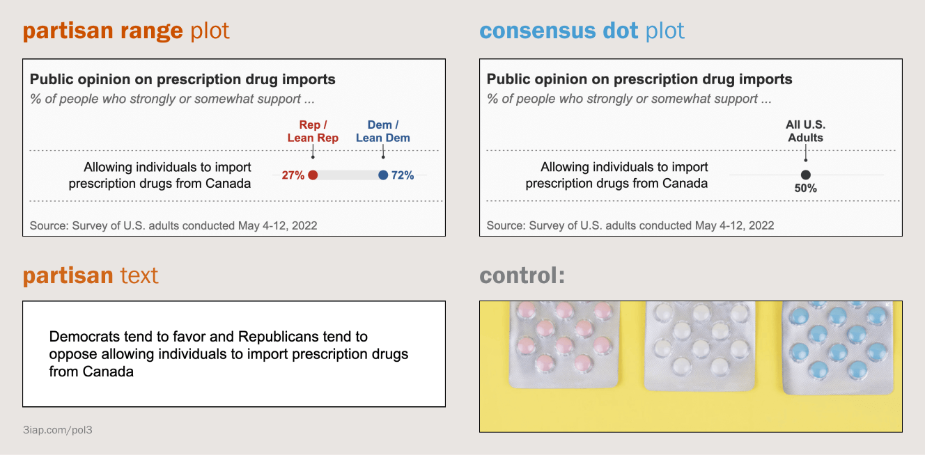
We tested four different conditions this time. The partisan and consensus charts are similar to last time, except instead of viewing a stack of policies like Experiment #1, participants only saw one policy at a time.
The partisan chart also changed slightly: It no longer shows the overall national popularity, only the popularity for each political party. We also added a text condition, similar to political science “partisan cue” experiments. And we changed the control to a stock photo.
One of the challenges with measuring conformity is that it depends on the relative positions of participants’ prior attitudes and the position of the reference group attitude,shown on the stimulus chart. The bigger the gap between your starting attitude and a proposed attitude, the more the proposed attitude will influence you. (This is based on an interesting social psychology theory of attitude change called Social Judgment Theory).
In Experiment #1, since we used a static chart based on realistic public opinion results, the gaps between participants’ starting attitudes and what they saw on the chart were quite small (since Experiment #1 was essentially repeating the original survey used to generate the stimulus charts).
So in Experiment #2, we needed a way to test larger gaps between participants’ starting attitudes and what we showed them in the charts. We made two changes to handle this:
- We switched away from gun control to policy topics that weren’t as well known, so we could make up random values without raising suspicion.
- We generated the charts dynamically, so we could test a distribution of stimuli values. This would let us look for a relationship between the stimuli values we showed and the response biases from participants. If that relationship exists we could conclude the values in the charts were the cause of the bias.
What are we looking for?
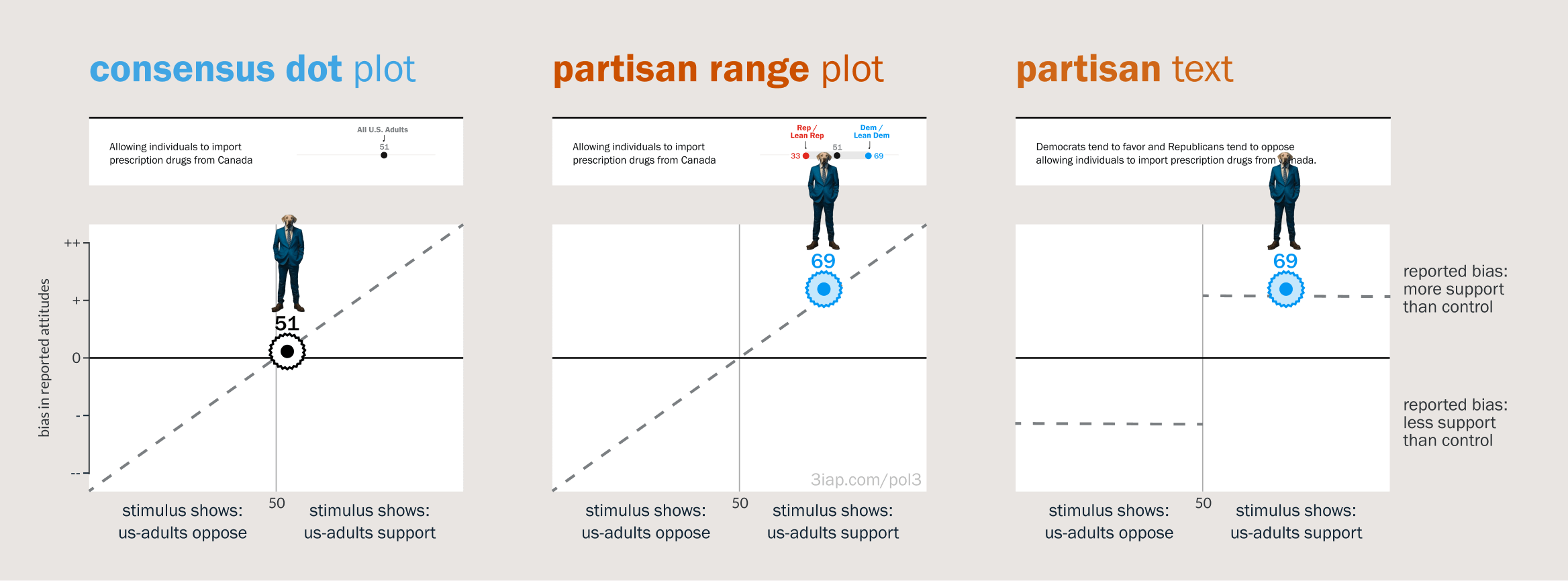
If there’s a social conformity effect, we’d expect to see a bias in participants’ responses that’s proportionate to the popularity shown in the stimulus charts. So we’d expect responses to fall along the dashed line in the charts above.
Results
We found a fairly clear relationship between the values generated for the stimulus charts and the bias in participants’ responses. When participants saw that their group supports a policy, they increased their support, and vice-versa.
The results for the consensus chart (left, above) show that if a policy is perceived as nationally popular, then it was more supported by participants. Note this has a more compact x-axis than the other two (from 30—70). This was for the sake of realism. By definition, even for hotly contested policies like gun control, the national consensus will still fall somewhere in the middle of the range.
The results for the partisan chart (middle, above) show that if a policy is perceived as popular with a participant’s political party, then it gained more support from participants in that party. Note that the x-axis here corresponds to the value we generated for the participant’s party.
The partisan text chart (above, right) has the same upward slope indicating that seeing party support is also associated with higher participant support. This is expected based on prior political science research. Here the curve tapers off more aggressively though. This is presumably because the text condition doesn’t actually quantify popularity with either party, it just says that it’s “supported” or “opposed.” So if we read into that chart, it might mean that the word “supports” in the text condition corresponds with 75-ish percent support for the population?
What this suggests, independent of polarization, is that public opinion charts like these have a social conformity effect and the attitudes they show can be contagious. If a chart shows that something is popular, then it becomes more popular with people who see the chart.
Experiment #2:
Polarization
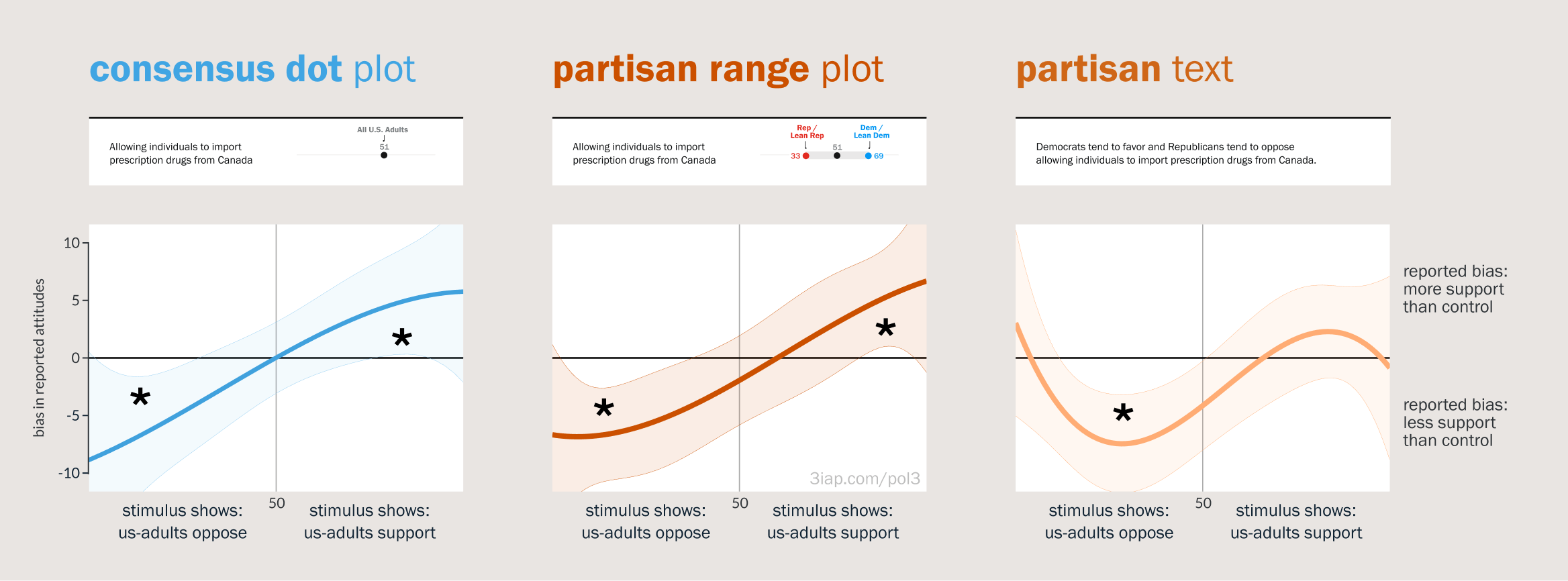
Can these charts influence polarization? Here we analyze our results from Experiment #2, testing for polarization.
Motivation
We’ve covered why polarization is a big deal. In the previous analysis we also showed that partisan charts were influential in ways that should lead to polarization.
If these charts nudge viewers’ attitudes toward their parties, and the two parties happen to take opposite positions on an issue, then it seems fairly reasonable to assume that people in those parties would diverge away from each other. Presumably if the above happens for two people, we should see it for whole groups of people.
On the other hand, in the previous analysis we saw that the national consensus charts can also be influential. Since these charts represent the national consensus (by definition), we might assume that if people from different parties shift toward the consensus view then their attitudes would converge toward each other and become depolarized.
Setup
We’re still using Experiment 2 data, we’re just analyzing it a different way.
What are we looking for?
We talked about different types of polarization, but to get more specific: We’re looking for issue polarization, where two opposing groups’ aggregate attitudes diverge away from each other (for some set of issues).
To be clear, this doesn’t necessarily imply a dynamic like “extremism.” It doesn’t even imply that the parties are necessarily moving toward more galvanized views. All we’re looking for are the groups moving away from each other, so it would still count as “polarization” if one of the groups happens to shift toward a more moderate or ambivalent position.
For example, one of the policies we tested was “requiring self-driving cars to always have a person in the driver’s seat, who can take control in an emergency.” This policy is oddly quite popular with both parties, but when we showed that it was unpopular with democrats, then liberal participants showed less support for the policy. That is, they became more ambivalent toward the policy. But since this movement was away from the Republican position, we’d still consider it polarization because it implies the two parties are increasingly misaligned.
To show depolarization, we’d want to see the opposite shift, where the average attitudes converge toward each other. Here we’re looking for typical group attitudes to converge toward each other. The gap between the parties should shrink.
Results
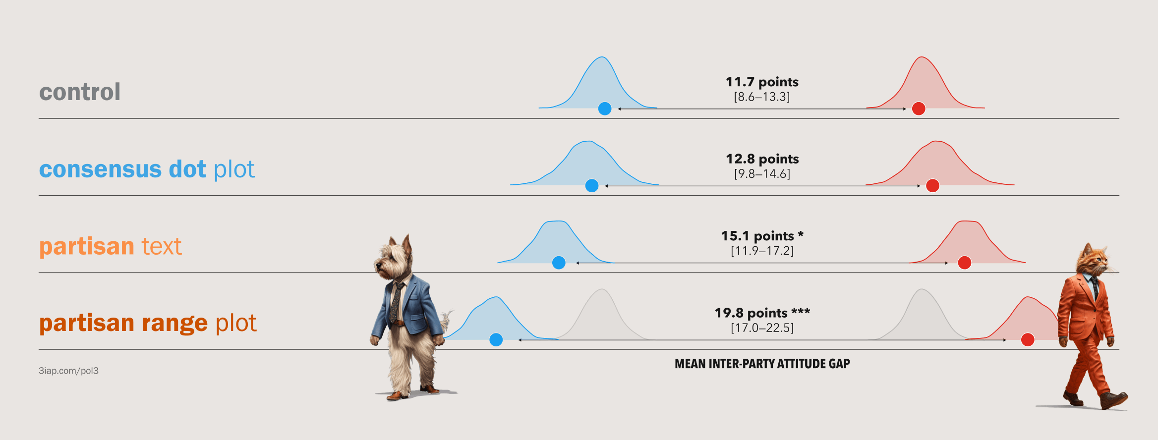
The results were quite stark. The chart above shows the average attitude gap that we calculated across all 5 policies (using a procedure called bootstrapping). The attitude gap jumped 69% from the control to the partisan range plot (from 11.7 to 19.8 points). The results show quite clearly that visualizing polarized partisan polling results can be divisive.
The gap for the partisan range plot was not only significantly wider than the control condition, it was even wider than the partisan text condition, implying the chart was uniquely polarizing. We have to be careful how we interpret this, because the partisan text and partisan range plot conditions aren’t exactly apples to apples. The text condition is not only a different medium (text), it also only says whether the parties support or oppose the policy without conveying the magnitude of support. So the difference might be the chart, or it might be the fact that the chart gives more granular detail. Either way, this shows that the chart has an even stronger effect compared to how these things are usually captured in political science survey studies.
Disappointingly, the consensus chart didn’t lead to depolarization. This might be because the consensus chart somehow had a weaker effect, or some aspect of the experiment design (e.g. a side effect of randomly varying the consensus value shown on the chart). Having said that, the consensus chart at least didn’t make polarization worse, so it’s arguably the least risky option we’ve found in terms of polarization.
Impact: What are the stakes? Is this a problem?
In this study, we show that public opinion charts can unreasonably influence viewers’ attitudes. And when these charts show polarization, they can influence attitudes in a way that increases polarization.
We’d still love more research to say how widespread these effects are in practice, but we can be reasonably confident they’re “real.” The significant (and substantial) attitude shifts would be hard to explain otherwise.
- The charts showing that a policy was popular made it roughly five points more (or less) popular on a 100-point scale.
- In terms of polarization, the partisan charts increased the gap between parties by over half (around 68 percent).
These effects suggest a number of social risks.
Risk: Increased Polarization
The first obvious risk is increased issue polarization, which we show directly. This applies to the partisan charts that increased issue polarization between people from opposing political parties.
Increased “polarization” isn’t intrinsically a bad thing. There are reasonable arguments that polarization is okay, or at least acceptable. So we’re not saying these charts are evil, just that they have risks we shouldn’t overlook. We might be okay with those risks. For example, if these charts increase polarization but also increase overall support for needlessly controversial issues like climate change or vaccination, perhaps they’re net beneficial.
Another caveat is that “issue” polarization doesn’t necessarily imply other types of polarization. For example, it’s not clear from our results how seeing policy disagreements impacts viewers’ feelings toward people from other parties (i.e. affective polarization). Other research suggests these are distinct phenomena and that different styles of reporting polarization can increase affective polarization while actually decreasing issue polarization; when reporting on individual “exemplars” of Democrats or Republicans who are particularly unreasonable, viewers become more reasonable in their own policy judgments but dislike the other party even more.
Even with the caveats, increasing issue polarization is still risky. To the extent that politicians’ and the media’s issue positions reflect their constituents, a more issue-polarized electorate can lead to more issue-polarized elites who are beholden to extremists and struggle to effectively govern. Or, even if “issue” polarization is a downstream consequence of “affective” polarization, accelerating issue polarization can still have dramatic consequences.
To the extent that we’re wary of increasing political polarization, we should also be wary of producing or publicizing partisan polling charts.
Risk: Laundering Misinformation
Polling charts can be risky without increasing polarization. For example, even though our consensus charts didn’t impact polarization, they were still influential. In all three of our experiments, regardless of chart condition, we found that if a chart showed that some policy is popular, the chart made that policy more popular.
Since political and social psychology suggest that the substance of an issue matters less than which groups endorse it, we might assume that this social contagion effect applies just as easily to bad ideas as good ideas. Since some perniciously silly ideas (e.g. climate change denial, vaccine conspiracies, wearing crocs in public) actually can be quite popular with certain subsets of the population, visualizing those groups’ attitudes might legitimaize these ideas and make them even more popular.
Risk: Undermining public health (equity)
Attitude contagion effects might also apply when charts unintentionally convey popularity. For public health, this might apply to charts that show intervention disparities between different social groups.
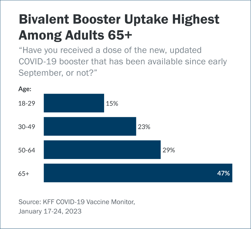
For example, this chart is intended to show a failure in the healthcare system to effectively reach younger demographics with Covid boosters. One way they could be misread though is that boosters are somehow less popular with young people (e.g. “boosters are only for old people”).
Since we know that popularity is contagious, charts like these might actually backfire and lead younger people toward further reluctance about getting boosted. Other research supports this argument, showing that behaviors can indeed be influenced by visualized social norms.
Risk: Undermining public knowledge
This last risk takes some unpacking. Visualizing public opinion polls is arguably unethical. These charts can promote epistemically irresponsible attitudes and beliefs. They can increase our convictions without increasing our knowledge.
To unpack this, let’s quickly recap ~2400 years of information ethics. Going all the way back to Plato, epistemologists (philosophers of knowledge) have argued that we can’t really know something unless we have good reasons to believe that it’s true. In 1877, W.K. Clifford, an epistemological ethicist (a judgy philosopher of knowledge) went a step further, arguing that belief without reason is actually unethical, because our beliefs affect everyone around us, at least indirectly. More recently in 2013, psychologists describe these unjustified beliefs as an “illusion of explanatory depth,” corroborating Clifford’s arguments with a relevant example of how one person’s attitudes can affect everyone else, suggesting that Illusory knowledge is itself a source of political extremism.
Based on Clifford, since the charts we’ve studied can influence someone’s support for a particular idea without justifying why that idea deserves their support, the charts are unethical because they promote unjustified beliefs.
Practical Implications
For survey researchers, political data journalists, and data visualization designers, what should we do differently?
Expect harm. There’s a journalistic norm that, as long as information is “true” and “important,” publishers are absolved of responsibility for any harmful outcomes from their reporting. The Times’ publisher advises journalists to be ”profoundly skeptical” that harms are anything more than the “subjective views” of sneaky political actors trying to undermine independent journalism. Our work suggests this consequential skepticism is misplaced. Even ostensibly neutral information like polling results can carry social risks that are worth conscious consideration. Further, since both election and issue polling are now empirically linked to democratically distortive consequences, political journalists may be better served by assuming political polling results are intrinsically toxic.
Weigh the (social) risks. Polling charts don’t just passively convey survey results, instead they actively influence the attitudes they visualize. This implies that producing or publicizing these charts is inherently risky. It can incur social costs like increased polarization or spreading silly, unjustified ideas. It’s not enough for charts like these to be clear and accurate. Instead they need to at least provide enough information value to offset their harm.
Don’t show that something is popular unless you’re okay with making it more popular. Public opinion doesn’t have to be “right” to be influential. Some people think the earth is flat. There may be polling results showing that this silly idea is quite popular within the surveyed group. If we were to highlight that finding, we’d risk making the silly idea even more popular. We don’t have to censor results like these, but to the extent that we reasonably believe that the earth is round, we should think twice about amplifying opinions that say otherwise.
Explain why attitudes are popular. Even though the non-partisan, consensus charts don’t increase polarization, they’re still epistemically sketchy since they can spread beliefs without justifying them. One obvious way to address this is offering justification. That is, when sharing polling results, it’s insufficient to just show that something is popular. There also needs to be context explaining why an idea deserves to be popular (or not). Like most data, pairing results with the appropriate context will help viewers to form their own attitudes, ideally based on stronger justifications than “all my friends are doing it.”
Resources and Next Steps
We’ll present our results at the 2023 VIS Conference in Melbourne this October and post the video here. In the meantime, feel free to dive into any of the following links.
- Our pre-print is available here
- Data and analysis code are here
- You can see our talk teaser trailer here on YouTube. This presentation was designed in collaboration with the brilliant Gabrielle Merite
- There’s also a brief background post here: A political psychology primer for information designers.
- For inspiration on depolarization, check out the Strengthening Democracy Megastudy
Huge thank yous to Gabrielle Mérite for art-directing the presentation and curating stylishly liberal dogs. And Cindy Xiong for advice and guidance throughout the project.